Friday, November 29, 2019

MUSIC VIDEO

PREP Watch the two videos again, looking in particular at differences in representation, camerawork and editing.
Your prep is to identify how the two videos differ in their representation, camerawork and editing. Pick only one example of each.

Representation:
  • The representation in Teenage dirtbag is different to the represenation in Sk8ter Boy as in teenage dirt bag we are made to see the main character is represented as lonely, shy, unpopular and getting called a looser. Who is just dreams about things that he would like to happen, e.g getting the most popular girl in the school. However in Sk8ter boy we are made to see the main character as a loud, very popular girl who everyone wants to be like, she is also made to look rebellious and someone who just wants to have fun and make the most of life. The main difference with sk8ter boy is that her isn`t actually a dream and it is in real life.
Camerawork
  • Camera work has a huge difference in the way we see the story, as in Teenage dirt bag the camera is always trying to tell a story in a persons perspective and it never breaks the 4th wall. From the slow and steady camera work it gives of a less energetic mood as  we are concentrating on the videos story line,  it also the fits to the songs beat well in some parts. On the other hand in Sk8ter boy the camera is always moving up, down, left and right following a range of different people and objects, as this gives a very energetic mood which fits the songs beat. 
Editing 

  • There are parts of editing in both parts, but is used in different ways. In teenage dirtbag it is used as a cut scene shot, as the camera keep cutting between the story line and the band perform, other parts of editing is when it cuts to the different times that that the main character has been neglected by other people and also at the prom when the girl chooses him. Editing is used in a different way in Sk8ter boy, as it is used to highlight how much attention is gathered by the rebel girl and group. The use of editing also allows us to see the star logo they are constantly spray painting it also is used to speed up some clips but also slow down others. In both videos editing is obviously used to fit the lyrics with what is visually happening.

MUSIC MAGAZINES - ROCK


Image result for music magazines

PREP Start to familiarise yourself with music genres that you don't know, by first picking a music magazine, either popular or classical music.
Explore the genre (say, Reggae, punk, rap, rock, prog rock, pop, urban, heavy metal, R&B, soul, country & western, orchestral, ...)
Post all of this writing as well as your chosen magazine cover on your blog with your comments underneath.

  • What kind of music is the magazine about? What kind of cover style would you and music fans expect? You could listen to their music as well as look them up.
  • Identify the central splash and describe how they are presented (what they are wearing, how they are lit, the expressions on their faces, how these fit with the type of music)
  • Comment on the use of typography
  • Looking at the cover as a whole, what can you say about the layout?


The magazine is clearly about rock, as we can tell from the large writing. The person in the centre splash is Robert Plant, a well known rock singer song writer. The layout of the magazine is expected as a rock magazine. The black background to highlight and draw attention to the other aspects of the magazine. Also the white writing is used as a highlight as it will make it stand out more to the readers. The top bar with the different musicians is another advertisement so people are more interested in looking inside the magazine. 

The central splash is Robert Plant a famous rock singer song writer. He is had a huge influence in many different areas in the music world such as Synth pop, blues, folk and a bit of African music. One of the reasons why he grew popular is as he spoke about the tragic death of his son Karac, who died because of a stomach virus at just the age of 5. This lead to Robert performing a song about it called `All My Love` whist on tour with Led Zeppelin. As well as this Robert has been in many bands including Led Zeppelin Page and Plant, The Honeydrippers, Band of Joy. From this we can tell that he is a iconic figure in rock who is appropriate for the central splash. The layout of the central splash pictures him as holy character up with the rock legends. He is also making eye contacted with us which may have a special effect on some big rock fans as he may be there hero. He is also doing something with his hands this gives us the idea of that he is doing something mischievous or trying to hide a secret which could possibly be him realising a new song. Once again this would excite many rock fans 

The use of typography in the magazine is a key aspect as well as it reflects the mood well highlighting the serious parts but also the joyful, less serious parts. The text also suites the genre of rock, as it look bold and brave like a rockstar would be.

The overall layout of the cover is very clean and good use of light and dark colours to create a depth concept. It also advertises other things in different areas of the cover, this is clever as it would attract even more people to buying this magazine. 

FILM OPENING


Media Film Opening

Saturday, November 23, 2019

How does Country Music create representations?


How does Country Music create representations


  • What kind of music is the magazine about? What kind of cover style would you and country music fans expect? You could listen to their music as well as look them up.
  • Identify the central splash and describe how they are presented (what they are wearing, how they are lit, the expressions on their faces, how these fit with the type of music)
  • Comment on the use of typography in The Shires coverline.
  • Looking at the cover as a whole, what can you say about the layout?

The magazine is about country music i can tell from many different reasons like; the large title, the bottom line words, the instruments the male is holding and also the top bar where it says about the group and their music success. I personally don`t listen to much country music, despite this for a cover of a country music magazine i would expect calm and smooth colours, but it should still have an interesting design to attract people into buying their magazine. After listening to their song Friday Night i think the use of energetic text, typography fits very well as the song is fairly up beat, from the text it allows us to see another side of their music unlike their other slower pace songs. It also look very wild and as a country style to it, this gives us an idea of why style of music it is. 

The central splash on this magazine is showing the two members of the group. We are made to see them in a important way as they both have serious face expressions, but also the lighting  plays a important part as it makes them look superior. In addition to this the males head over laps the main title this makes  them look more obvious but also gives the overall magazine a clean look. We can also tell they are both wearing fairly casual clothes to fit in with the quiet colour scheme, but also the style of music they play. 


Looking at the magazine as a whole i think it looks very clean and fits the country genre look very well. I like the use of colour as it reflects the mood of the songs they produce, but also fits the country genre as a whole very well.  

Thursday, November 21, 2019

GENRE CONVENTIONS- THE OBSERVER

THE OBSERVER GENRE CONVENTIONS 

There are many features that can correspond with the Observer to complete the broadsheet genre. In this front cover some of features that link it to fit the genre conventions are; the large colourful sky box allows the newspaper to catch eyes, the blue lines for professionalism and also underline the newspapers name (Observer), the large headline so the readers are introduced to what the main story is within the newspaper and wither it is serious or not, the style and size of the front so it is easy to read, the large picture on the front cover is also a important genre convention for the Observer as it give a format to the cover but also could interest the people looking to buy the newspaper. As we can see this newspaper fits the genre convention of a broadsheet newspaper.


Saturday, November 16, 2019

REPRESENTATION: CUFFS


REPRESENTATION: CUFFS

Donna Prager:

Unlike in other movies where women are seen as weaker or less capable than men, Donna is the opposite. She is represented as a both mentally and physically strong women, who is not easily beaten, this can relate to many other occasions when women have not given up an example includes the suffragette movement. 

In the police force her is partner Lino, he is shown not to be the best police office as he easily gives up and isn`t always up for it. This means that Donna has to do more work to make up for the weak link. She also has a kind and thoughtful attitude with Lino, something that does not happen in all police partnerships. In Cuffs we see her doing her job well and whole-heartedly on multiple occasions.  It also pictures her as a very experienced police officer who trains at similar standards to her colleague Ryan. From Donna we are shown that gender doesn`t prevent anyone from fighting crime and keeping the streets safe.

Jake Vickers:

Life in the police force has its ups and downs for Jake, with his dad being the chief Superintendent but also his partner being tough on him even though he is new. As a result of  his dad`s position he is able to go through without training and serve as a police man on the streets. This lack of training soon shows as we see him make a couple of mistakes. His colleagues are not pleased with this, and Ryan regularly tells him off. Despite this, Jake does not let this put him down and we seem him grow through out Cuffs, and in some situations he saves the day.   

From these examples we know that gender does not have an effect on the way the police force works. 

Friday, November 15, 2019

BBC: INDUSTRY AND AUDIENCE


BBC: INDUSTRY AND AUDIENCE
BBC`s history: The BBC stands for The British Broadcasting Company, and was formed on the 18th of October 1922 by a group of leading manufactures first started when it did daily broadcasts in one of the London studios. The first broadcast was on November 14th 1922.
BBC`S mission “to act in the public interest, serving all audience a throughout the provision of impartial, high quality and distinctive output and services which inform, educate and entertain.”
BBC `S Values:
·        Trust is the foundation of the BBC. They`re independent, impartial and honest
·        They put audiences at the heart with everything they do
·        They respect each other and celebrate each other’s diversity
·        They take pride in delivering quality and value of money
·        Creativity is the lifeblood of our organism

BBC`S public purposes:

·        To provide impartial news and information to help provide the viewers understand the world they live in
·        To support learning for all ages
·        To show the most creative, highest quality and distinctive output and services
·        To reflect, represent and serve the range of different communities of all the UK
·        To show the different cultures and values of the UK to the world


Sunday, November 10, 2019

How far does Cuffs adapt police drama genre to fit its family audience at 8pm on BBC1? [15]

Cuffs adapts to its showing times in many ways so that the younger viewers do not see unsuitable things for there age, this is the watershed.

One of the ways is how there is minimal violence and when there is we do not see any gory pictures. This is done as we do not want younger viewers knowing lots about violence. They may also not like the sight of graphic photos. However, this does not change the conventions of a the police genre as there is still plenty of action out of the movie as we see police chases and them dealing with the public under pressure, this still creates tense moments which engages the viewer.

Another way that Cuffs adapts to its timing is the language used. In Cuffs we rarely ever hear bad language, this is for obvious reasons such as we don`t want to encourage young children into using bad language. Once again the producers find a solution to this so we can still see the characters emotions this is done by changing the tone in the different peoples voices, an example is to express anger; instead of swearing they may have a louder tone this could also be followed up by an outburst of possible violence e.g slamming a door or breaking an object.

Furthermore there is no scenes of nudity or sex, this also is because of the time of the showing. However alternatives are made like how instead we can see how to characters share a bond by the emotions shown when the two characters are shown and if they are both normally on camera together it suggests to us that they have a strong connection.

To conclude Cuffs adapts a fair amount to the showing time, however it finds other ways to make the viewer interested, but also stay in the police movie genre 

Monday, October 14, 2019

Lego movie marketing


Lego movie marketing

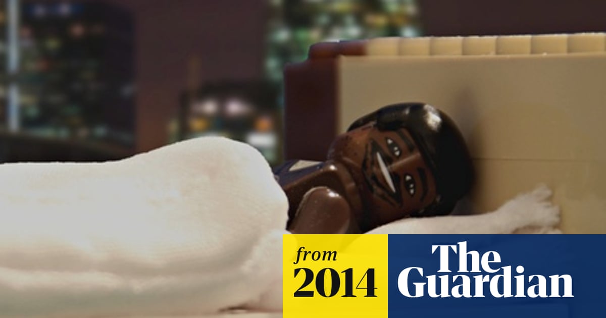
Image result for lego movie advert by warner bros actual advertsIn the Lego movie advert it transforms normal adverts into a Lego version the adverts included where the BT advert, British heart foundation, Premier Inn. I believe it does this as it is trying to gain the viewers’ attention as it is different from the usual adverts, it also gives the viewers an idea about what the movie is like whilst trying to excite them.
Image result for lego movie advert by warner bros actual advertsThe use of Lego in some of the more grown up adverts which children would normally be interests in make it more interesting for bot the children and the adults or parents watching, in addition to this is also bring the family more together so it creates a overall memory of the advert.
In the end the advert was a great success and got many views on YouTube (around 1.3 million) and while it was being streamed. It also then got a much higher selling rate.

Wednesday, October 9, 2019

EMMA PEEL AS A STEREOTYPE/ ANTI-STEREOTYPE


Anti-Stereotypical
  • ·        Emma is a very well-educated women, as we see her in the starting scene she is writing a scientifically book and outsmarted steed in the fencing match.
  • ·        She also is a master in martial arts, and never back down for any fight or calls for help

Stereotypical
  • ·        Wears a tight cat suite which shows her body off, portraying her as a sex object to the viewers
  • ·        Once again in one of the scenes (fencing) the camera work zooms into her bottom and this once again shows her as an object whilst also shows Emma as a toy of Steed